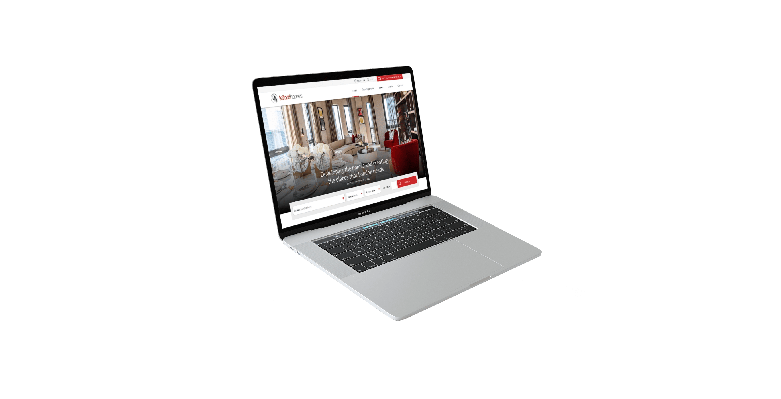


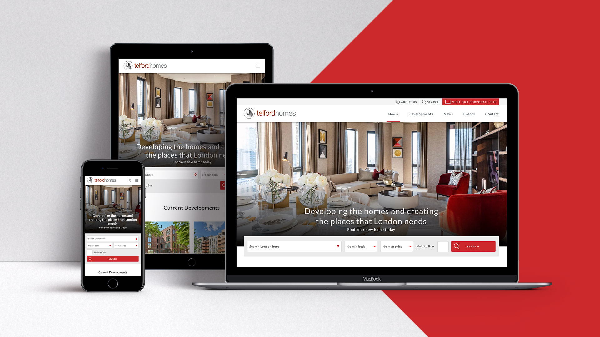
Telford Homes is a leading housing developer in London. Under rapid business growth, Telford Homes asked us to overhaul their website which was lagging behind modern standards in both usability & security. The brief included requirements for a customer focussed interface, responsive layout, accessible CMS and stronger brand presence as key deliverables.
We wanted to enhance the usability of the site; giving greater power to the customer to find the home of their dreams.
As with all web design projects we began by creating profiles for the potential visitors to the site and taking this information to create an effective user experience. This takes the form of wireframe prototypes which gives us a great starting point to establish the ‘flow’ of the site.
We identified 2 key customer groups - investors and home buyers, and this process made us double down on giving these users more power and more information.
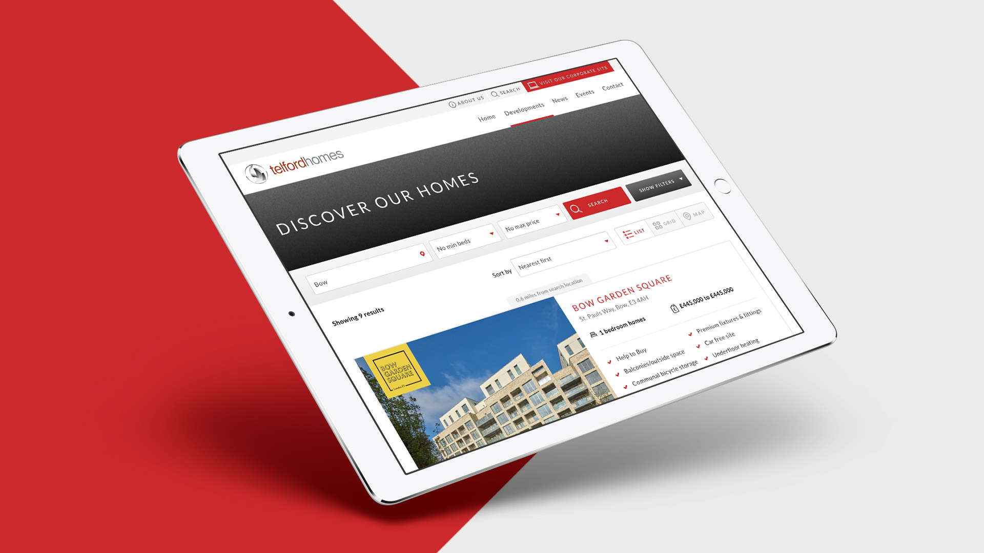
We allowed users to search by price and number of bedrooms; and then we gave them clear information about the key features and location of each development.
The new development overview pages allowed users to see beautiful images of each development and get a feel for them at a glance, with useful tools such as mortgage calculators, local transport routes and contact details available at your fingertips.
“The team at Planet could not have done more to help us launch our brand new website - not only have they offered us an amazing level of support but our new website looks fantastic and we’ve had lots of great feedback on the design and streamlined customer experience.”Kerry Hill - Head of Marketing
Behind the scenes the new website was built on a Wordpress CMS. Giving the site a solid foundation and the accessibility that allowed the client and us to keep the website up-to-date with all the most recent information. Also with google analytics and Yoast SEO built in, the website was future proofed to ensure engagement and growing traffic.

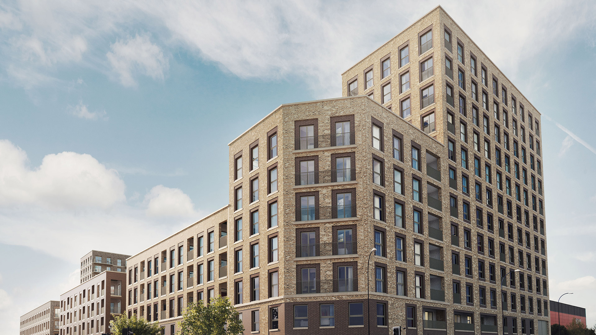
Each Telford Homes development has its own microsite. These sites serve as a key sales tool, each with unique branding that shows off the new homes and the highlights of the location.
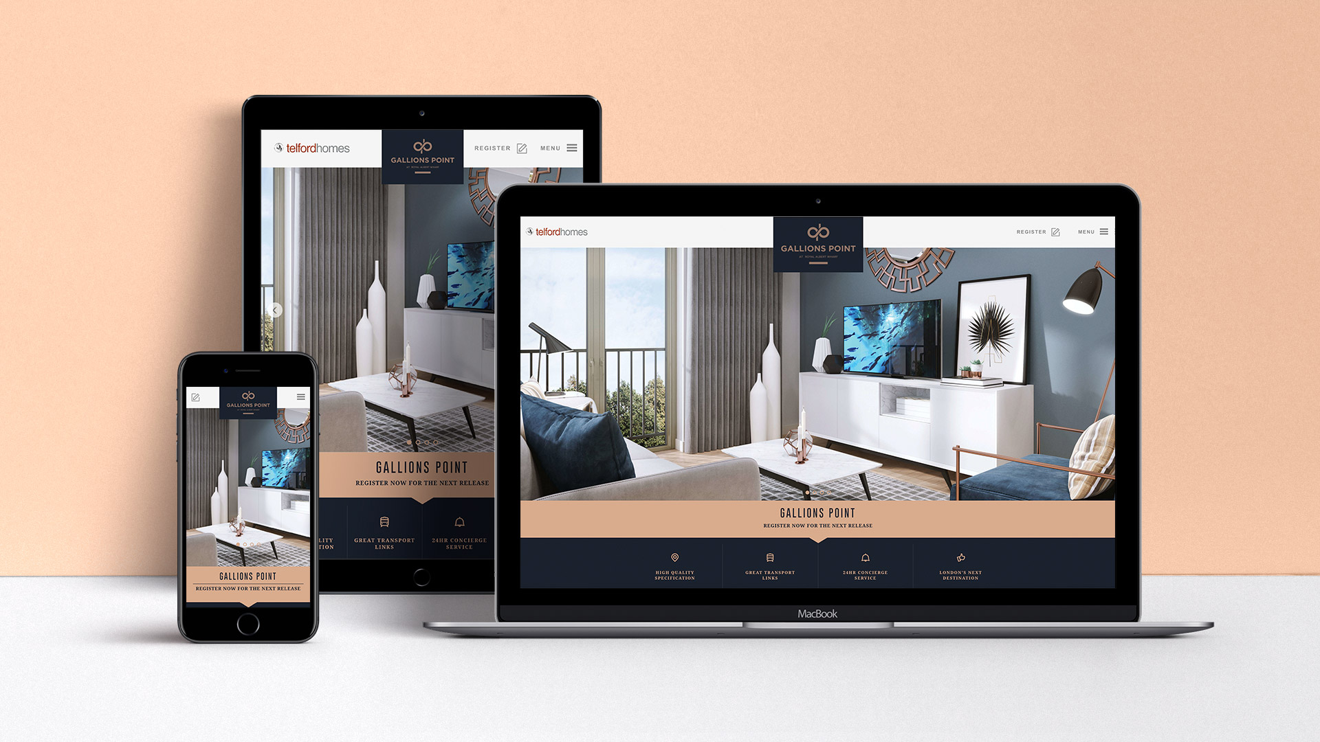
Creating these microsites presented a unique challenge, they needed to have familiar layouts to ensure they were all easy to use, they needed to be cost effective to setup and they needed to reflect each developments unique branding.
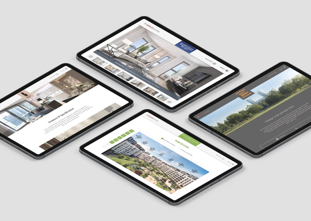
To deliver on this we created a templated structure, which was flexible enough to give each website its own flavour, whilst retaining a familiar and effective structure. These sites successfully gave users what they were looking for, whilst promoting all the key features of each development.