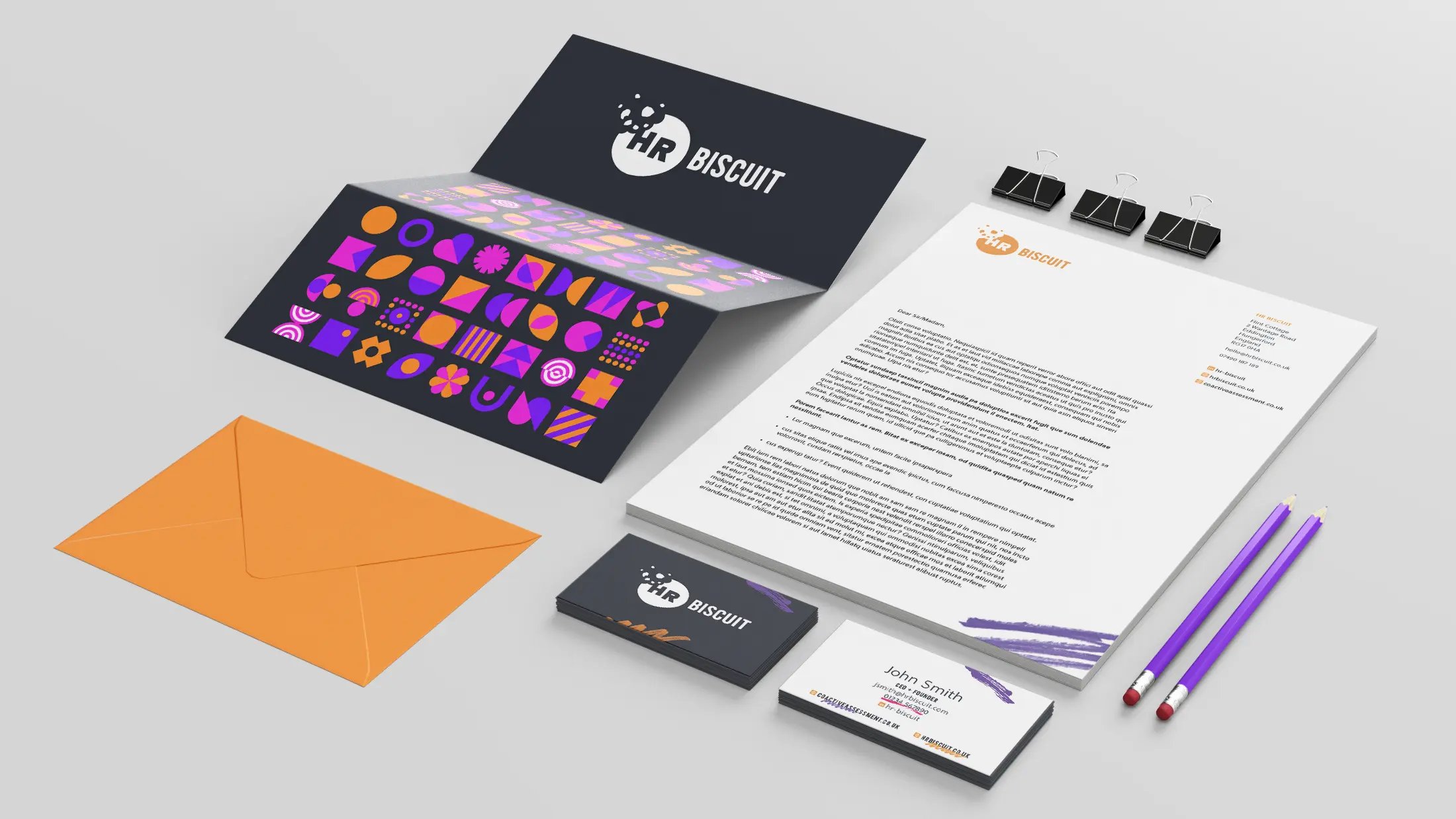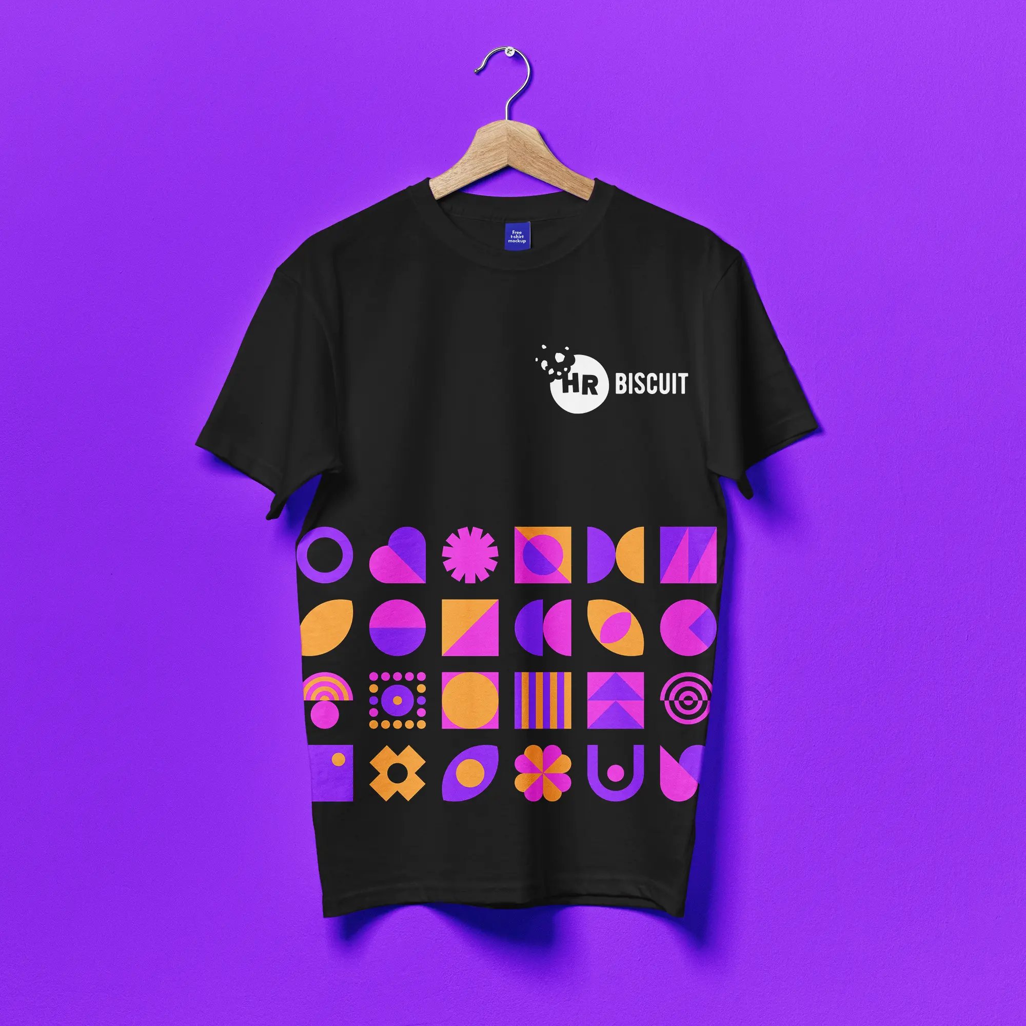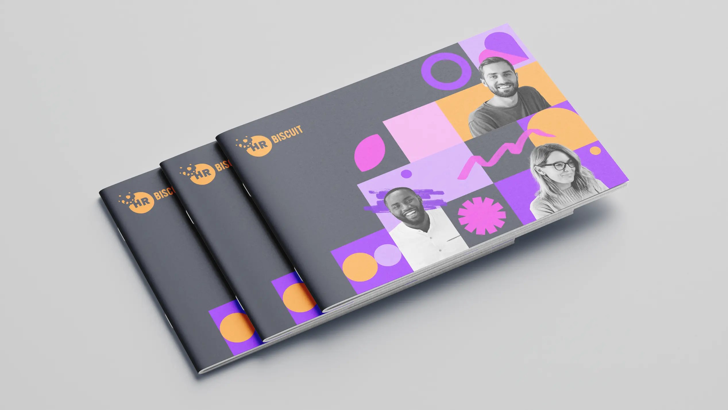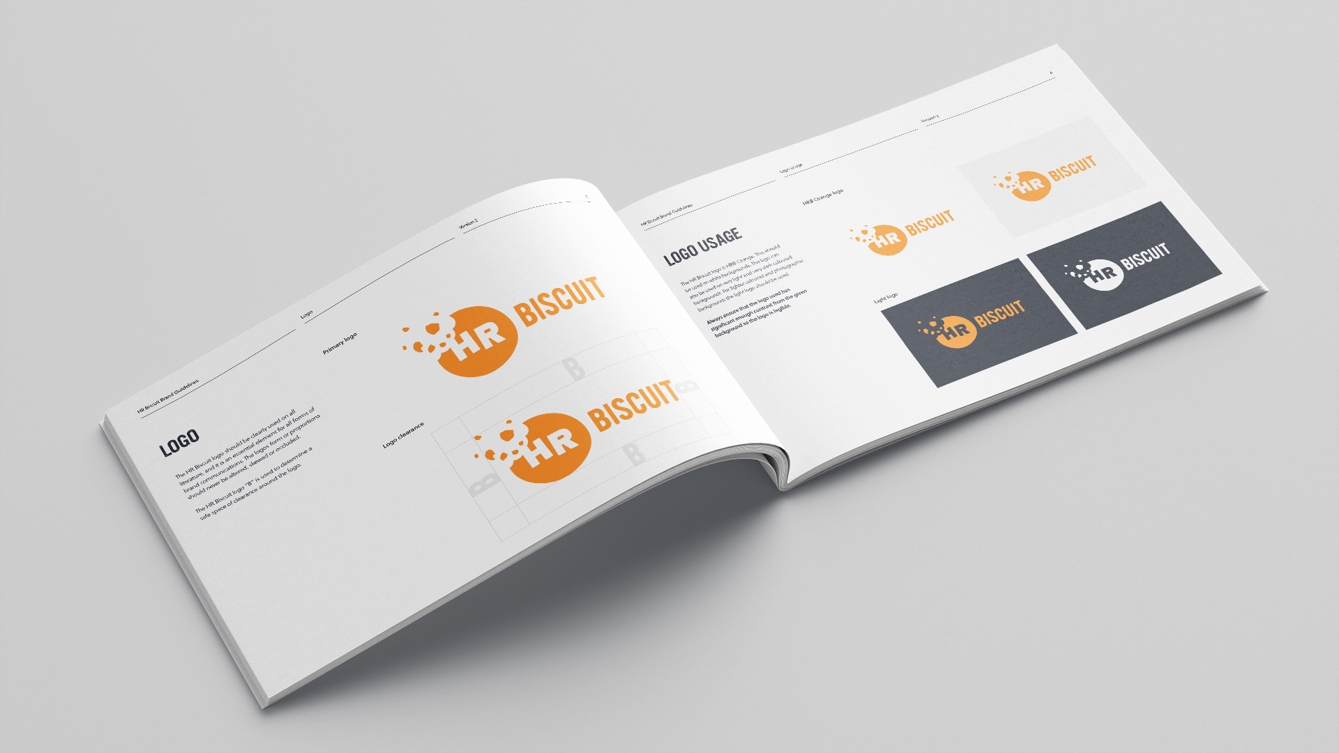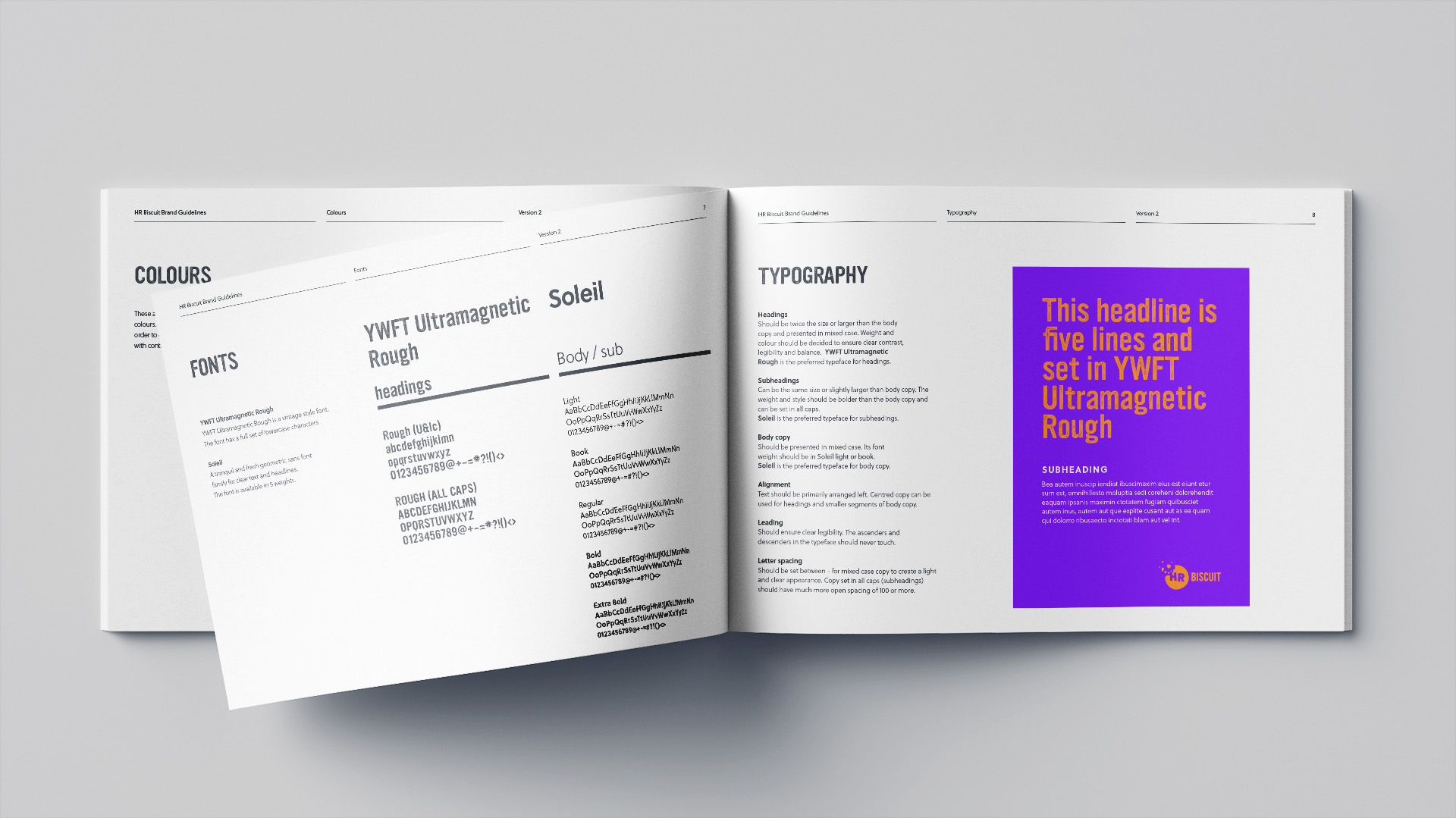


HR Biscuit wanted their new brand to have a friendly and personable touch, whilst also being colourful and diverse which reflected the business's quirky and inclusive ethos.
As with most projects we like to explore a variety of options when tackling a brief, ranging from the more corporate to the more free form. But ultimately the client decided to bite the biscuit, choosing the quirky option that looked the most biscuit like.
However with so many great ideas, we injected a lot of the DNA from our other concepts into creating a beautiful and colourful brand identity.
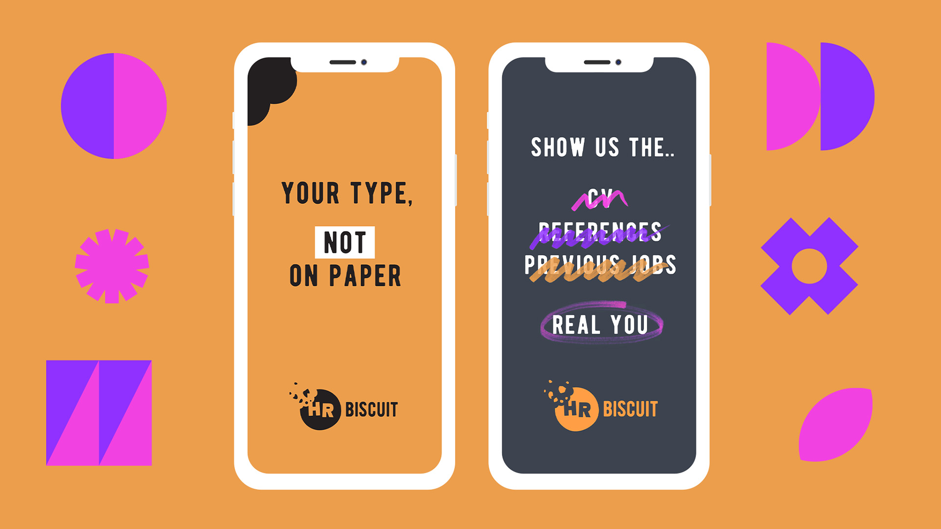
The brand features colourful icons which looked great both static and animated, forming cohesive patterns that reflected the diverse inclusiveness of the brand.
This was supported by the human touch of hand drawn elements which worked as graphic flourishes to highlight key info.
